Rooted in compassion and community, The Mama Edna Project was founded to address food insecurity and uplift those in need.
.webp)
A primary goal was for a clean, accessible, smooth experience for users on all devices, and the numbers reflect that success.
The Mama Edna Project has been around for over a decade, but with the opening of Mama Edna's Thrift Store, their community impact and involvement has skyrocketed, so clear communication and accessible forms and resources has been crucial to connect with those in need of their services, as well as future volunteers and donors.
Here's a breakdown of what was needed, and what we were able to accomplish.
A digital hub to connect with their community in a way their old Wix website couldn't. The ability for staff and volunteers to manage the site with ease was an important point, and executing on that would extend the life of the site.
Bringing together web design, branding, optimization, AI, and hands-on support to build a digital presence that feels polished today and stays easy to grow, measure, and improve tomorrow.
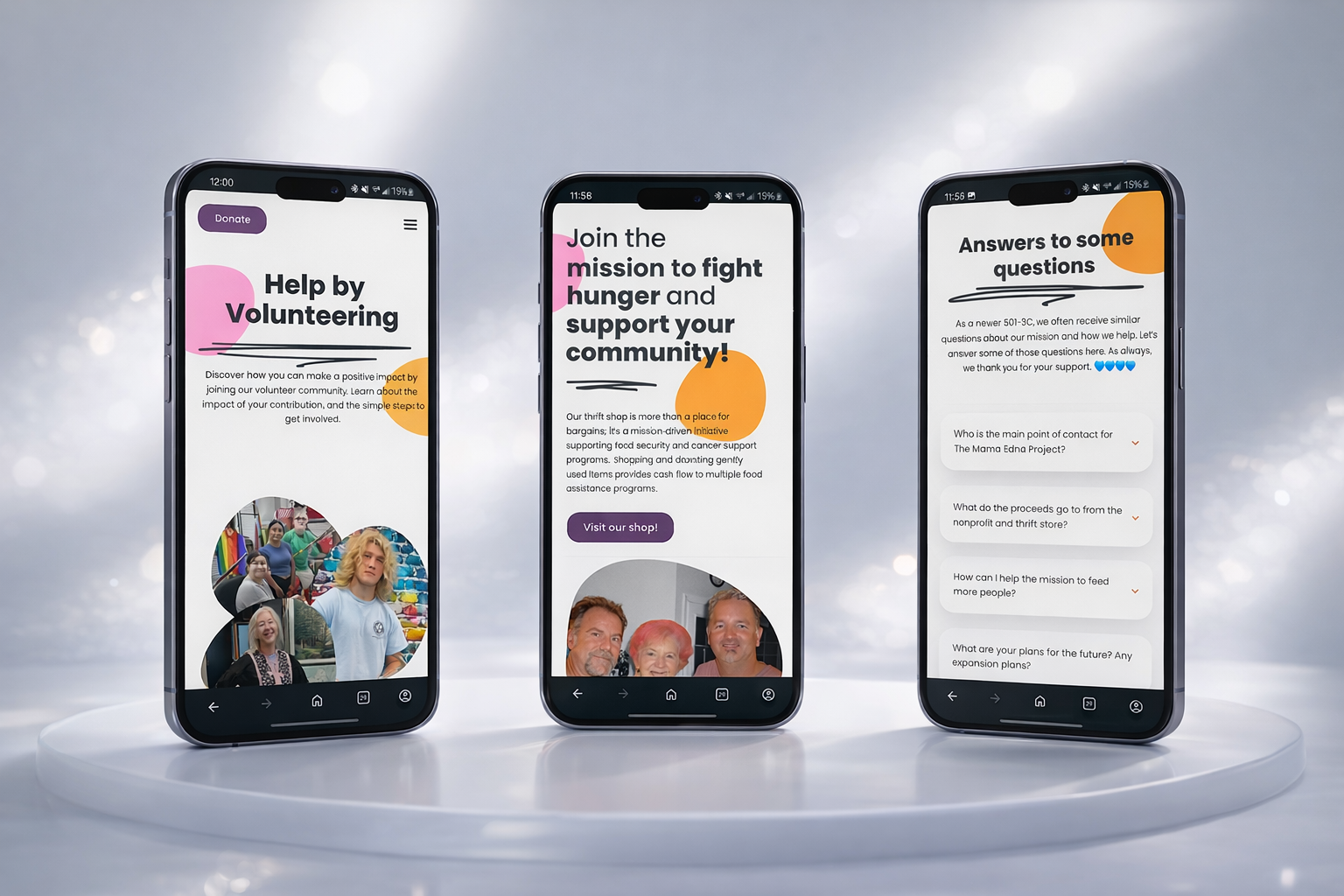
Designed to be clear, responsive, and accessible on every device. This is a sharp contrast from their previous site, which didn't properly scale for mobile devices. This has been important to further connect with those in need and those who want to support the project.
Mobile visitors now consume the majority of a sites traffic, commonly ranging from 60% to 85%. A site not ready for a mobile visitor is a site that will struggle to connect with those they serve.
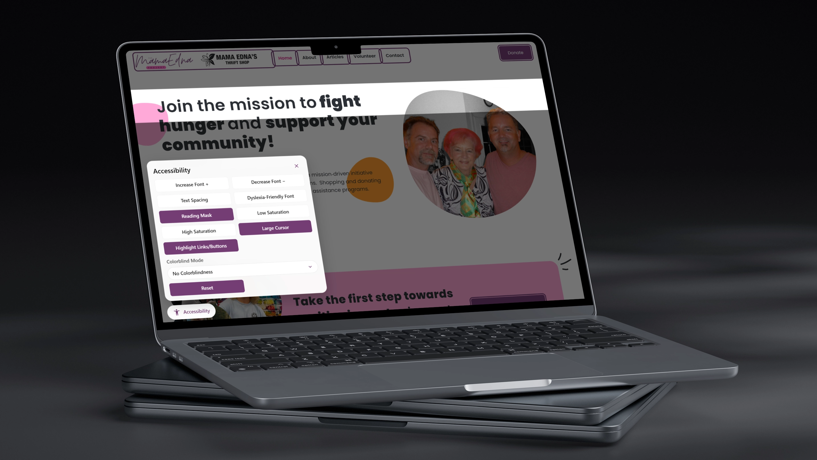
Built with inclusivity at its core, the site offers robust accessibility controls that adapt to each visitor’s needs. From adjustable text sizing and spacing to colorblind-friendly modes and a dyslexia-friendly font, every feature is tailored to make content easier to read and navigate. These tools help ensure that community members of all abilities can fully engage with the mission, whether they are seeking support or looking for ways to give back.
Roughly 1 in 6 people worldwide live with a disability, yet only 3-4% of sites meet accessibility standards.
Featuring a fresh, modern layout, this site combines bold typography, vibrant accents, and clean white space to create an engaging experience that feels both polished and welcoming on any device.
Thoughtful, modern design makes the site easier to trust, navigate, and use, so more visitors feel comfortable exploring resources, getting help, and taking action to support the mission.
.webp)
The site is set up with simple, intuitive editing tools so staff and volunteers can easily update text, swap photos, and keep key information current without needing technical expertise.
An easy to manage site means staff and volunteers can keep information accurate and up to date, which builds trust and reduces confusion for visitors.
.webp)